成绩分配
| 内容 | 分数 |
|---|---|
| 课上测验 | 10分×2次 |
| 个人作业 | 10分 |
| 小组讨论 | 10分×2次 |
| 期末考试(开卷) | 50分 |
期末考试内容:
| 内容 | 分数 |
|---|---|
| 单选题 | 2分×5题 |
| 判断题 | 2分×5题 |
| 简答题 | 10分×2题 |
| 综合题 | 60分 3题 |
ps:授课老师 zjz,期末考试第二章不考。
第一次测验
Prototyping
In the year 2100 all cars use electric energy only.
At power stations, cars now fill up by themselves, there is no need to get out of the car anymore.
A new type of interface is needed through which the car driver can specify how much electric energy the car should get. The input device for this information is a CD-sized round touch-screen display that is placed inside the car.
原型制作
在2100年,所有汽车仅使用电能。在发电站,汽车现在可以自己装满,不再需要离开汽车。我们需要一种新型的界面,使得汽车驾驶员可以通过该界面指定汽车应获取多少电能。用于此信息的输入设备是CD大小的圆形触摸屏显示器,该显示器放置在车内。
第二次测验
2.1 题目:分析并给出一个Problem和一个Good Feature的UAR
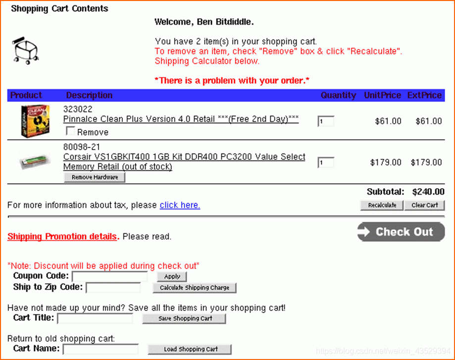
2.2 Problem 参考
| Identifier | HE1—Problem |
|---|---|
| Name | 历史购物车搜索需要用户回忆 |
| Evidence | Heuristic: Recognition, not recall 界面方面:整个界面最下方的返回历史购物车, 如下图所示。 |
| Explanation | 在通常情况下,如果要搜索历史记录,为了避免让用户痛苦地回忆,会把历史记录都列出来,以让用户通过点击来选择加载哪一条历史记录。而在这里,给出一个文本输入框,期望让用户自己想起来曾经存过的购物车名字,而不给任何提示信息,用户很可能根本已经想不起来购物车的正确名字了。 |
| Severity | 这无论对于新用户还是有使用经验的老用户来说都会存在一定问题。对于新用户来说问题较为严重,因为他们第一次使用历史购物车搜索功能时,不知道还要自己输入购物车名字,因此之前没有特意记过名字,所以会导致根本无法使用此功能。但如果是有经验的老用户,则会特意记住曾用过的购物车名字,但是需要他们费力去回想,很不方便,也会降低程序的体验感。 |
| Solution/ Trade-offs | 可以考虑用一个加载了该用户历史购物车名字的下拉框来替换文本输入框,用户点击下拉框,出现下拉名字列表,选中一个名字,该名字就会显示在框内。 |
| Relationships |
2.3 UAR 示例
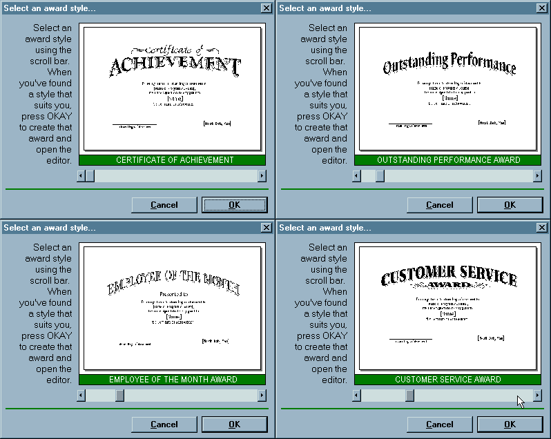
| Identifier | HE1—Problem |
|---|---|
| Name | 水平滚动条的使用不符合windows标准 |
| Evidence | Heuristic: Consistency and standards (尤其是Consistency) 界面方面: 如下图所示,对获奖证书的模版选取是通过滚动条实现的。 |
| Explanation | 在通常情况下,如果水平滚动条出现在图像、文本框或是其它对象下方时,都是表示可以通过移动水平滚动条来显示图像、文本框或其它对象内容中水平方向上其它部分的内容。而在这里的应用不是为了显示一个获奖证书模版水平方向上的其它内容,而是用来选择不同的模版。 |
| Severity | 可能只对新用户来说会存在一定问题使用问题。因为当他们认为这个水平滚动条就是用来显示水平方向不同内容时就会忽略它,从而不能有效的使用这个功能。但当用户注意到提示信息后,或通过简单的拖拽试验就会知道水平滚动条是用来进行模的版选择。 |
| Solution/ Trade-offs | 可以考虑用其它表示选择的控件来替代水平滚动条,例如,列表框。 |
| Relationships |
2.4 启发式的10条规则
- Match the Real World
- Consistency & Standards
- Help & Documentation
- User Control & Freedom
- Visibility of System Status
- Flexibility & Efficiency
- Error Prevention
- Recognition, Not Recall
- Error reporting, Diagnosis, and Recovery
- Esthetic & Minimalist Design
期末考试 回忆
一、 选择题
(大部分是第一、四章内容,以下仅对部分选项做回忆)
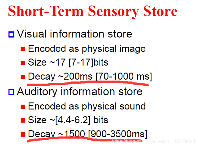
- 考到了视觉信息和听觉信息的衰退时间,如下图
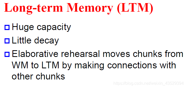
- 考到了Long-Term Memory中的“Elaborative rehearsal moves chunks from WM to LTM by making connections with other chunks” ,选项中吧Elaborative换成了Maintenance,如图
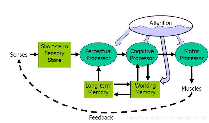
- 考到了感知处理、认知处理、Motor(不知道怎么翻译)处理的先后顺序,如图
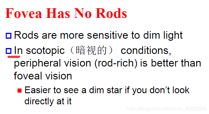
- 考到了这句话“In scotopic (暗视的 conditions, peripheral vision (rod rich) is better than foveal vision”内容没变,如图
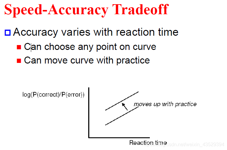
- 考到了如图反应时间和正确率的关系
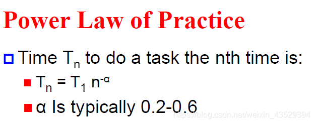
- 考到了如图所示的定律,主语是这个定律的名字,但后边的解释对不上
(只记得这么多了,基本上第四章全考了一遍,第一章考了一部分)
- 好像是考了“更好的交互需要花费更多”(原话好像不是这样的,只记得有个more cost)
二、 判断题
(题目先后顺序记不住了)
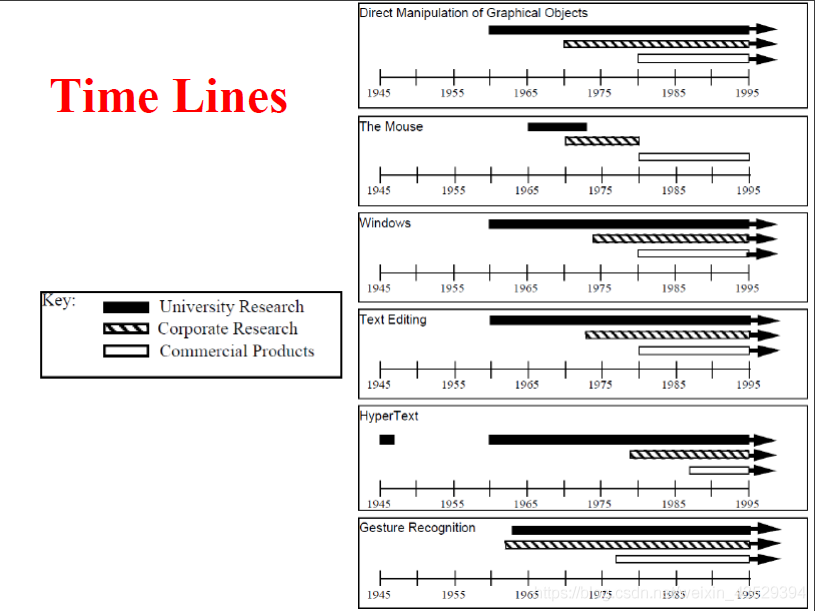
- 商业关于人机交互的研究总是(always)先于(precedes)大学的研究。(对应ppt第一章中的Time Lines,如下图)
- 啊,没顺序了,记不住了
三、 简答题
- 有一款类似于“找你妹”的游戏(原话不是这样的),你想要增加游戏的难度,请问你最好可以调整哪个视觉变量来实现?(对应ppt第五章关于视觉设计的内容)
- 一个小组打算使用焦点访谈小组来获取用户的一手数据,是否合适?为什么,哪一种方法更合适?
四、 大题
-
有一个公司为盲人设计了一款网上购物系统,并且使用语音来指导盲人使用,题中给了一个“访谈主体和行为变量对应”的图。 (类似下图)
行为变量有:
使用过手机--------从来没有使用过手机
面向服务的--------面向价格的
必需品--------娱乐
喜欢送货上门的--------(自取的?记不清了)
前几次使用的时候需要帮助--------不需要帮助
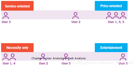
(1)根据这张图找出重要的行为模式
(2)根据行为模式描述主要人物模型
(3)描述人物场景
-
有一个面向小学生的双人PK成语(idiom)练习平台,是移动手机端,比赛时通过图片提供线索,用户需要在屏幕上手写输入成语,率先答对10道题的用户获胜。平台包含了所有小学生需要掌握的成语。(故事板不需要涉及注册)
(1)使用叙述型故事板描述使用场景(usage context)
(2)使用顺序型故事版描述主要的流程
(3)使用分支型故事版描述所有的过程
-
有一个线上出售书籍的网页截图(截图很普通,存在部分不一致问题),让写一个UAR HE1——Problem报告,并且给出了UAR报告模版表格,有问题的地方需要在截图中圈出。
Identifier: HE1——Problem Name: Evidence:
Explanation:
Severity
Possible solution and/or Trade-offs:
Relationships:
(差不多就能想起这么多,笔者不对内容的准确性和部分观点的正确性做保证,请大家理性参考)
个人作业要求
What you must do:
-
Choose an application to observe. This can be a Web page, a standard application, a utility program—even a gadget or appliance that has interesting user-interface features.
选择要观察的应用程序。这可以是一个网页、一个标准应用程序、一个实用程序,甚至是一个具有有趣用户界面功能的小工具或设备。
-
Write an essay of no more than ten pages in length. The essay should include:
写一个长度不多于10页的论文,论文需要包括:
-
A brief description of the system or application you are critiquing. If at all possible, include a picture or drawing to help us understand this application. (10 points)
一个关于你要评判的系统或应用的简短介绍,尽可能的包含一个图片或者图画来帮助我们理解这个应用。(10分)
-
A concise statement of the problem you have observed. (10 points)
对你发现的问题做一个简短的陈述。(10分)
-
An explanation of why you believe this is a problem based on the content of "Basic Psychology Needed for Interface Design." (Don't merely say that a feature is "annoying" or "ugly," but explain how it forces a user to perform the tasks of perceiving, processing, or acting in ways that are difficult for people.) (10 points)
基于“界面设计所需的基本心理学”解释你为什么认为这是一个问题(不要只说一个特征是令人恼怒的或者丑陋的,而是解释它是如何迫使用户以人们难以理解的方式执行感知、处理或行动的任务的)。(10分)
-
A suggestion for improving the design and a rationale for that suggestion. (10 points)
改进设计的建议和该建议的理由。(10分)
(When proposing a solution, try to be as realistic as possible and not suggest costly or complicated enhancements. For example, it probably would not be reasonable to propose that VCRs should recognize and process human speech, as this would make them very expensive, if not unfeasible to build.)
(在提出解决方案时,请尽量现实,不要提出昂贵或复杂的增强建议。例如,建议录像机应该识别和处理人类的语音可能是不合理的,因为如果不是不可行的话,这将使它们非常昂贵。)
-
A method for testing your new design to see if it actually solves the problem. This part should include brief descriptions of
一种测试新设计的方法,看看它是否真的解决了问题。本部分应包括以下内容的简要说明:
-
What you would measure about people's behavior as they use the original application and your modified redesign. (10 points)
当人们使用原始应用程序和修改后的重新设计时,你怎样衡量他们的行为。(10分)
-
The types of people you would use in your test (e.g., computer-savvy experts or novices, etc.). (10 points)
测试中使用的人员类型(如精通计算机的专家或新手等)。
-
The tasks that you would ask those people to perform. (10 points)
你要求这些人完成的任务。
-
A prediction of the results you might get. (10 points)
对你可能得到的结果的预测。(10分)
-
What those results would mean if you got them. (10 points)
如果你得到这些结果意味着什么。(10分)
-
-
Format your report as Word documents. (10 points)
Details of format requirements refer to the homework template.
UAR报告 说明和模版
Complete this form once, as the first page of your report:
| Product Name: <Name of this product or thing being studied> |
|---|
| Date of Study: <When run> |
| Experimenters’ Names: <Names of experimenter or experimenters present> |
| Subject ID: <Anonymous identifier for the subject. Usually a number. Not used for HE> |
Complete this form for each problem or good aspect that you observe. (An empty form, suitable for actual use, is on the last page. These are the instructions).
| No. <The type of observation (HE or UE) and unique number> (HE=Heuristic evaluation; UE=User Evaluation) Problem/Good Aspect < say which > |
|---|
| Name: < Succinct but descriptive and distinctive name for the problem or good aspect.> |
| Evidence: Heuristic: < For Heuristic Evaluations, list the name of the heuristic (e.g., “Consistency”) > Interface aspect: <Where the problem is. Include relevant facts about the interface. In addition to interface facts, pictures are almost always necessary and usually faster to produce than words alone, unless you are very skilled at providing word pictures> |
| Explanation: <Your explanation of what’s bad or good about this interface aspect. For Heuristic Analysis, put your explanation about how the heuristic is met or violated. If applying the heuristic involves making claims about the user (e.g., what the user will or will not be familiar with), include claims and any evidence/reasoning to support those claims. Locutions such as, “The [expert, novice] user will *probably…because*…” or “Users will be *unlikely* to….*because*…” are appropriate here.> |
| Severity or Benefit: *Rating:* <number + description. Use Nielson's ratings: (see http://www.useit.com/papers/heuristic/severityrating.html) 0 = Not a problem: I don't agree that this is a usability problem at all 1 = Cosmetic problem only: need not be fixed unless extra time is available on project 2 = Minor usability problem: fixing this should be given low priority 3 = Major usability problem: important to fix, so should be given high priority 4 = Usability catastrophe: imperative to fix this before product can be released > Justification (Frequency, Impact, Persistence, Weights): *Frequency:* <Common or rare? Why? How many users (of what type—new, causal, experienced are likely to experience the problem? Why? Is this something most users, some users, hardly any users will probably want to do? Why?> *Impact:* <Easy or difficult for the user to overcome? Why? If is difficult to overcome if the user is unlikely to be able to achieve goals or will probably waste a lot of time.> *Persistence:* <Is it a problem that is one-time (once users know about it and overcome it—no matter how difficult it was to detect and to overcome) or will they be repeatedly bothered by it? Why? (If they can’t detect it and overcome it, then it persists)> *How I weighted the factors:* <Justify your numerical rating by providing your assessment and reasoning about all of the following: frequency, impact, and persistence, and how you weighed these factors in your overall severity rating. For example, A relatively rare problem, easy to overcome and low persistence could justify rating as a minor usability problem; a low frequency problem but one that is critical occurs (e.g., Unable to Save) would be grounds for giving it a high severity rating, despite low frequency. If this is a good aspect, then Rating is “NA,” but describe the benefits to the user that you see from this aspect. > |
| Possible solution and/or trade-offs: < If a problem, propose a possible solution. You MUST include trade-offs to be credible. If you can’t think of some bad trade-off, say so. If a good aspect, then trade-offs also are appropriate > |
| Relationships: <Cross reference other UARs this relates to (if any). Include No & name. If the relationship to the other UAR is not obvious, then give reasons why you list it here (because…)> |
Template:
| No. Problem/Good Aspect |
|---|
| Name: |
| Evidence: |
| Explanation: |
| Severity or Benefit: *Rating:* Justification (Frequency, Impact, Persistence, Weights): |
| Possible solution and/or Trade-offs: |
| Relationships: |
Source: Carnegie Mellon University Brad A. Myers & Bonnie John
原文标注可被自由复制和使用